Wrong
Geometries in The Third Man
Richard Misek
|
Wrong
Geometries in The Third Man |
|||
|
1. Paul Schrader, Notes on Film Noir in Alain Silver & James Ursini (eds.), Film Noir Reader (New York: Limelight Editions, 1996), p. 57.
2. Gilles Deleuze, Cinema 1: The Movement-Image. (London, The Athlone Press, 1986), p. 14.
3. Rudolf Arnheim, Art and Visual Perception: A Psychology of the Creative Eye. (Berkeley, University of California Press, 1974), p. 295.
|
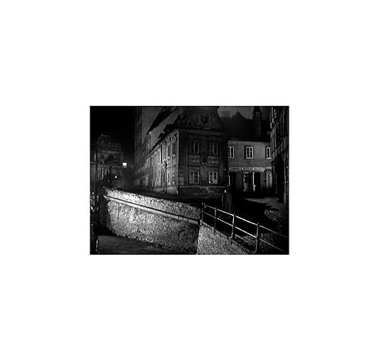
Few films are as closely identified with a city as The Third Man (Carol Reed, 1949) is with Vienna. Over the years, seemingly endless journalistic, academic, and cinephilic attention has been devoted to the physical locations used in the film. To the present day, guided tours take visitors through the squares, onto the Ferris wheel and even into the sewers that Carol Reeds film transformed into icons of the city. This analysis provides a counterpoint to the popular fascination with The Third Mans locations, focusing instead on how the film diverges from its setting, and how it abstracts and reorientates the citys spaces. The specific site of divergence explored is that of the line. The Third Man begins with a shot that is both an index of a physical object (a zither) and an abstraction of that object into a series of parallel lines (fig. 1). In relation to the city in which it was filmed, the entire film can also be seen in two ways: as a visual document of the bombed-out fabric of late 1940s Vienna and as a stylised filmic environment built on the aesthetic foundations of German Expressionism. By means of mise en scène and lighting, The Third Man transforms Vienna into networks of lines. Throughout the film, Carol Reed and his cinematographer Robert Krasker place the camera in positions that emphasise line for example, on top of a suspension bridge (fig. 2) or at the centre of a Ferris wheel (fig. 3) and frame shots so as to draw attention to lines that in most films would be compositionally insignificant. Early in the film, Holly Martens (Joseph Cotton) introduces himself to refugee actress Anna (Alida Valli), the bereaved girlfriend of his seemingly-deceased schoolfriend Harry Lime (Orson Welles). As Holly stands in the doorway of her dressing room, the frame of the door divides the rectangular frame of the shot into segments with mathematical precision (fig. 4). Later, when Anna and Holly walk home to her apartment, the beam of a collapsed pillar obliquely bisects the frame (fig. 5). Reed and Kraskers famous Dutch angled shots continually transform physical details including doorways, windows and staircases into lattices of diagonals. Paul Schrader observes that in classical film noir it is the sharp angles of the city not the movements of the characters that have compositional priority. (1) The same is true in The Third Man, a film whose visual style owes much to noir: Holly and Anna walk behind the collapsed pillar, not in front of it. Line is further emphasised by the cameras immobility. Camera movement in The Third Man is generally restricted to minor reframings and discreet tracks into and out of characters faces. Jib shots, long dolly shots and crane shots are almost entirely absent from the film, resulting in stable compositions that invite the eye to explore their many vertices. Even in chase sequences, the dominant camera set-up remains that of the tripod shot, emphasising the complex urban topography that the characters must negotiate. For example, when Holly and Anna are pursued by a crowd of bystanders who believe Holly has killed the caretaker at Harrys apartment block, the most oppressive presence is not the gaggle of locals chasing them but a collapsed flight of steps that spills across the frame, a reminder of the violent reconfigurations to have recently afflicted the city (fig. 6). Additional diagonals result from the use of high contrast lighting. In the films exterior shots, powerful HMI floodlights shine down streets and across walls (fig. 7). Sometimes the lights pick out lines that are already there for example, the bevelling on the side of a building or the receding rails of a tramline (fig. 8) and sometimes they create new lines. Not only do the edges of shadows form lines on walls but the rays of light themselves sometimes appear as lines that hang in mid-air (fig. 9). In his discussion of German Expressionism, Gilles Deleuze observes that light is the subject of a geometric optic, when it is organized with shadows into two halves, or into alternating rays (2). In The Third Mans nocturnal exteriors, shadow and light are so sharply defined that the borders between them also take on an architectural form, competing with the lines of buildings and streets to inscribe space. The above examples draw attention to the fact that the lines in The Third Man do not create a graphic, two-dimensional aesthetic like that of a comic book drawn in black ink on white paper. Rather, they exist in three dimensions: the films diagonals are also orthogonals. As seen in figure 9, these lines have an x-axis, a y-axis, and a z-axis. As well as crossing the plane of the screen, they recede within the frame towards a vanishing point. Reed and Krasker emphasise the z-axis through their Wellesian use of wide-angle lenses, which allow lines to maintain their sharpness from foreground to background (fig. 10). Of course, wide-angle lenses also heighten depth perception through their compression of horizontal and vertical space, so lending even further compositional importance to the films orthogonals. In its emphasis on line, in its stillness, and in its use of orthogonals receding towards a vanishing point, The Third Mans cinematography approximates the organising principles of early Renaissance perspectival painting. In the quattrocento, perspective was the means by which spatial unity was reconciled with artifice. Its discovery allowed painting to become simultaneously more verisimilar and more complex. Perspective in The Third Man fulfils an analogous function. The films wide-angle cinematography owes a debt not only to film noir but also to Orson Welles and William Wyler, whose work according to André Bazin formed the apex of Hollywood realism. At the same time, its emphatic orthogonals transform the profilmic city into a cinematic distortion of itself. The films perspectival compositions are also thematically appropriate. When looking at a painting with a central vanishing point, we can follow Leonardo da Vinci in imagining light rays radiating out from the vanishing point in a cone. As Leonardo further suggested, the imagined cone of light within the painting is mirrored in front of the painting, as light rays converge on the retina of the spectator (3). Single point perspective implies a spectator who is motionless, facing the centre of the composition head-on and standing at a distance otherwise the full effect of the composition cannot be appreciated. It draws the spectators gaze into the image, towards the vanishing point, but pushes the body back. Analogously, for much of the film Holly finds himself drawn into the action but kept at a distance. Though he is the protagonist, for the first hour of the film he has no agency all he can do is watch as events unfold. Nowhere is this more apparent than in his attempts to protect Anna from deportation to Czechoslovakia. While searching her apartment, a policeman asks her a question. Holly tells her not to answer. Without a moments hesitation she answers, aware that Hollys alpha male posturing cannot help her. Of course, Holly is an outsider culturally as well as narratively. He is an American pulp fiction writer, oblivious to local customs and political realities, and socially excluded by background and class. He is kept at a distance not only by the native Viennese but also by the British occupying force: only the lowest status character in the film, Sergeant Paine (Bernard Lee), shows him any respect. Staying at a hotel requisitioned for the use of British soldiers, Holly is an outsider among outsiders. Only we are more out of the picture than Holly. |
|
4. Andreas Huyssen, The Disturbance of Vision in Vienna Modernism in Modernism/Modernity, vol. 5 no. 3 September 1988, p35-6.
|
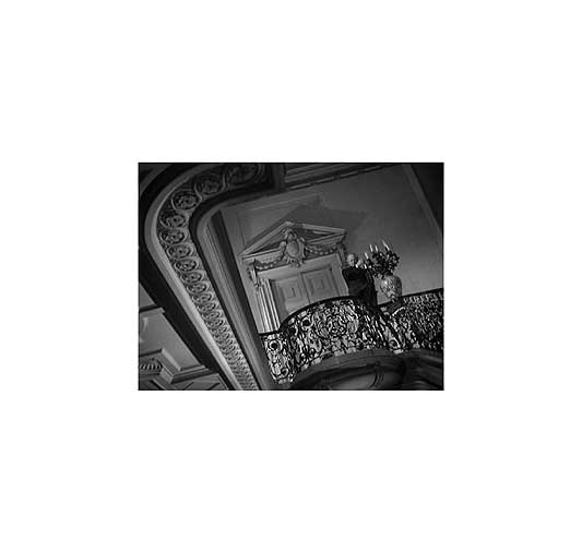
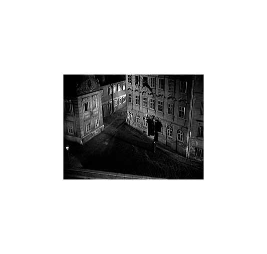
Despite the various parallels between the films compositions and those of quattrocento painting, the analogy of Renaissance perspective is not quite sufficient to describe the effect of the films multiplicity of lines either on Holly or on the spectator. The perspectival look is usually thought to be one of visual mastery, involving the orientation of all the components of the image towards the spectator: when looking at a Renaissance painting, the spectator sees everything. By contrast, Hollys vision is partial and aspects of his world-view for example, that Harry is not a criminal often need to be corrected by those who see the full picture. Holly has no perspective on what is happening. In addition, again unlike the spectator of a painting, he is looked at as much as looking: everywhere he goes, Viennese eyes follow him. Throughout the film, brief inserts of bystanders faces create a point-of-view shot structure of which Holly is the object not the subject (fig. 11). Harry also watches Holly from the street outside Annas apartment (fig. 12). Though Holly cannot see all these people watching him, he feels their presence. Just before his pivotal first encounter with Harry, Holly conducts a drunken conversation with a seemingly empty street, declaring his intention to go back home and concluding with the line, Its what you always wanted, all of you! Andreas Huyssen observes, with reference to Viennese literary modernism, that the experience of otherness in a city is linked to the experience of being seen and expresses itself in the form of disorientation, a feeling of being decentred (4). Having established perspectival vision, The Third Man disturbs it. Look again at figures 2, 7, and 12. What is wrong with these shots? How do they disturb perspectival vision? The answer is that their vanishing points are outside the frame. The orthogonals converge off-screen, decentring the composition: they exert a centrifugal force on the eye, drawing it to visually inaccessible off-screen spaces. (See illustrations at the end of this essay.) Often, as in figure 12, there is more than one external vanishing point, and orthogonals compete to draw our attention in divergent off-screen directions. Renaissance spatial unity is exploded, leaving a void in the centre of the frame. Like Holly, we too are not sure where to look. |
|
|
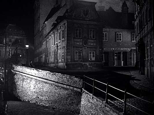
The disorientating potential of multiple vanishing points is taken to an extreme in a low-angle shot of the street outside Annas apartment (fig. 13). Like much of Viennas innenstadt, Schreyvogelgasse, the street in which this shot was filmed, is built on a steep gradient. On one side, a row of houses resists the incline of the hill and clings to horizontality; on the other side, there is a sheer drop to another street with a different gradient. Kraskers cinematography transforms this improbable place into a seemingly impossible space. Mise en scène and lighting combine to emphasise multiple orthogonals, directing the eye to multiple vanishing points simultaneously, as if the image were a collage of irreconcilable perspectival environments. The effect, exacerbated again by the use of a wide angle lens, is closer to the psychotic spatial overcrowding of Max Beckmanns Die Synagoge (1919) than the placid linearity of Crivellis Annunciation (1486). The startling image of Schreyvogelgasse highlights the fact that even the basic standard of spatial orientation, a stable horizon, is absent from The Third Man. The films constantly shifting horizon is of course a product of its Dutch angles. In a close-up, the effect need not be especially disorientating, as close-ups tend to be spatially decontextualised, allowing a single object for example, a face to fill the frame. However, in exterior wide shots depicting complex spatial relations, the effect of Dutch angles can be intensely disorientating. Is the street in figure 7 on a gradient, or does it just seem that way? Are any of the streets in figure 13 horizontal? The films exterior wide shots are so consistently Dutch angled that ultimately they turn the entire city into a vertiginous space. They not only reflect the point of view of a character who cannot see straight, but also form an integral element of the films architectonic structure. The entire film is predicated on the absence of a visible horizontal axis. |
|
|
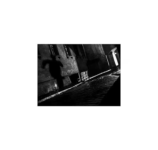
The Third Mans wrong geometries also take place over time. Inevitably, in the fourth dimension, they take a metaphoric turn, manifesting themselves in the discrepancy between the straight lines of Hollys excursions through Viennas innenstadt and Harrys more fragmentary movements. Holly embodies linearity, he is the main thread running through the film, an almost continuous presence from scene to scene, himself following the trail of the elusive third man in a causal, linear narrative. Hollys progress through the city is that of an outsider, unsure of his step, placing one foot in front of the other. In his movements from location to location, he follows the cartographic lines of the city streets, and in his movements from shot to shot, he follows the axis of classical continuity editing: the position of the camera ensures that we know which direction Holly has just come from and in which direction he is going. Harry, by contrast, embodies non-linearity. He is an insider, a central figure in Viennas underground network of black marketeers. He has a detailed knowledge of the citys urban spaces, moving freely from one occupied zone to another through a network of intersecting sewers. He follows oblique paths that contradict the mapped urban geometry of the city streets, and surfaces in seemingly unconnected locations across the city: a bridge, a square, an amusement park. Narratively too, Harry follows a broken line of appearances and disappearances, playing a cameo role in his own story. For most of the film he remains an absent presence, like Bertha in Jane Eyre, existing in other peoples descriptions of him. While Holly is tied to real locations, moving through streets whose existence is documented by the camera, Harrys movements are imagined movements. The tension between Hollys linearity and Harrys non-linearity manifests itself most acutely when their paths first intersect, in the films famous doorway sequence. The result, for Holly at least, is a moment of extreme disorientation. As Holly walks home from Annas apartment, Harry appears out of the shadows in a doorway, illuminated by the light from an upper storey window. He is visible, but the manner of his appearance and the way in which his face floats in the darkness create the impression of a projected image rather than a corporeal presence. Is Harry real, or is he an illusion, a dream, a doppelganger a symptom of Hollys disturbed vision? Before Holly can find out, the light goes out, and Harry disappears. After a few moments of incomprehension, Holly approaches the doorway, but his path is obstructed by a passing car. In the first wide shot of the car passing, Harry is clearly still present: the tips of his shoes stick out from the darkness of the doorway. The same is true of the subsequent wide shot, in which his shoes can be seen withdrawing into the shadows. Then, as Holly reaches the doorway, there is a cut to a closer shot. The editing matches on Hollys action, establishing the illusion of temporal and spatial continuity, yet in this closer shot, Harry is gone. In a manner reminiscent of the cinematic trickery of Georges Méliès, he has disappeared in a cut. While Holly is tied down by the leaden spatial conventions of continuity editing, Harry moves impossible distances in the space between shots. No wonder Holly cannot find him. No wonder we never see Harry when Holly chases after him, but only hear his footsteps and glimpse his shadow. Harry moves through off-screen space, in a parallel Vienna that has no physical form. Holly is figuratively as well as literally chasing a shadow (fig. 7). |
|
|
 |
|
|
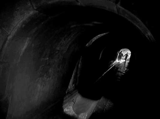
For the next fifteen minutes Harry remains a shadow before materialising again in Prater Park. This appearance is very different from the last: it occurs during the day, and we see Harry approach from a distance in long duration shots interspersed with conventional reaction shots of Holly waiting. The scene at the Ferris wheel takes place in the Russian zone, where Harry is not a wanted man, so he does not need to play the magician. It is a crucial scene, the only one in which Holly and Harry face each other and talk, but narratively and visually it is a dead-end: Harry makes an offer of partnership in crime that Holly does not accept. Instead, Holly allows himself to be persuaded by Major Calloway (Trevor Howard) to betray Harry, ensuring that in their next and final meeting this time in the British zone Harry walks into a police ambush. In their final encounter, Harry once again appears as if out of nowhere, but this time his appearance is followed by a startling inversion. Realising he has been set up, Harry again makes a quick escape, but this time does not disappear. Rather, Holly disappears, and the camera stays with Harry. Suddenly, unexpectedly, Harry becomes the films protagonist, so that what previously held for Holly now holds for Harry. As he flees from the police, he remains present in every shot, no longer able to slip between the cuts of the film and create his own virtual trajectory through imagined city spaces. Thus Harry crosses over into, and becomes a prisoner of, the denoted city. Harrys first instinct is to do what he always does and go underground, crossing back over from the denoted city into the imagined city. But alas, now when he enters the sewers, the camera continues to follow him, and so the sewers also become denoted. Accordingly, the disorientation previously experienced by Holly when he chased Harry, a result of the mismatch between denoted place and the visual construct of cinematic space, is now experienced by Harry. In fact, the disorientation becomes even more acute for Harry than it was for Holly. Holly may not have been able to catch up with Harry when he chased after him, but at least there were recognisable landmarks by which he could later reorientate himself, returning with Major Calloway to the precise location at which he lost Harry. In the sewers, however, there are no landmarks and no street names. The spatial coherence of the city, previously distorted, is now shattered into pieces. Each piece is a shot. Each shot exists in isolation, its only connection with previous and subsequent shots being the fleeing figure of Harry himself. Early on, there are occasional repeated set-ups: for example, Harry runs through a space and a few shots later his pursuers run through the same space). These repetitions create a visual structure that allows us to infer that Harrys pursuers are on his trail and only seconds behind him. However, as the chase continues, continuity editing is soon left behind. The cutting begins to follow more graphic principles, with shots placed next to each other based on their compositional properties rather than narrative logic: left-leaning Dutch angled shots are placed next to right-leaning Dutch angled shots, perspectival long shots are placed next to medium close-ups, and so on. In fact, the shots of Harry running through the sewers could have been edited together in any number of different combinations and they would have made just as much or as little spatial sense. Harry tries to forge a path through the sewers, but his progress is restricted to a broken line of movements through monadic shots. |
|
|
 |
|
|
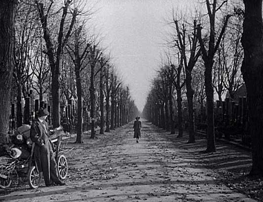
As already suggested, Harrys movements through cinematic space belong to a far less conventional mode of filmmaking than Hollys. In the sewers, their divergence from the norms of classical Hollywood reaches an extreme, and the films latent avant-garde tendencies become apparent. Like the dinner guests in Luis Buñuels The Exterminating Angel (1962), Harry finds himself in conflict not with any narrative agents but with the very form of the film that he inhabits. If only he could shrug the camera off, pass it back to Holly in their tag game of narrative point of view, then maybe he would have a chance of escape. But it is not to be. Again and again, though we catch glimpses of Holly in pursuit, the unblinking eye of the camera keeps returning to Harry and preventing him from disappearing. So too, the films editing conspires against him, preventing him from finding an escape: at every new manhole that he reaches, an insert reveals a group of soldiers awaiting above ground, while the insert that he is looking for a shot of an empty street is cruelly withheld until it is too late and he has already been mortally wounded. In a sense, Harry is killed both by Holly and by the films warped construction, so it is only fitting that he dies entangled in the twisted planes and chiaroscuro patterns of a spiral staircase. Harry dies, but the film continues for a few minutes more, with a scene at his funeral in which the narrative resolution of his death is transformed into a graphic resolution. The funeral ceremony finishes, and Holly waits at the side of the road as Anna approaches. After over a hundred minutes of wrong geometries, The Third Man concludes with a shot in which the horizon is horizontal, the composition is symmetrical and at last there is a vanishing point exactly where it should be in the centre of the screen (fig. 18). But though the film at last achieves a stable Renaissance perspective, the human geometry is wrong. Holly and Anna, the films romantic leads, ought to follow classical Hollywood convention and walk together away from the camera, hand in hand towards the vanishing point of their shared future. Instead, Anna walks towards the camera. She does so at such a steady pace that visually as well as narratively it is no surprise when she keeps walking right past Holly. As Anna exits screen right, Holly lights a cigarette. |
|
|
 |
|
|
The film ends, but it is possible to imagine the shot extending for a few more moments. Holly finishes his cigarette, stubs it out, and then also walks towards the camera, exiting screen left as a visual counterbalance to Annas exit screen right. In cartographic terms, Anna and Holly walk along the same vector, taking the main road out of the cemetery. Perspectivally, however, they follow divergent paths away from the vanishing point, like two spokes radiating out from the centre of the Ferris wheel at Prater Park. The lines of their lives move not towards but away from each other. |
|
|
|
|
|
|
|
|
|
|
|
|
|
© Richard Misek and Rouge, July 2007. Cannot be reprinted without permission of the author and editors. |
|||